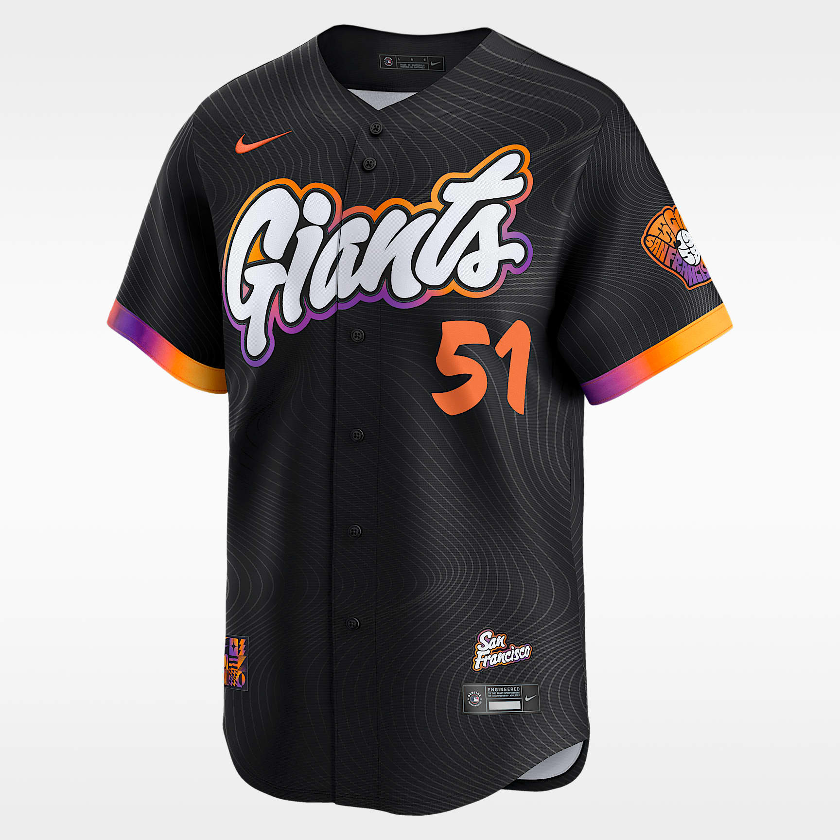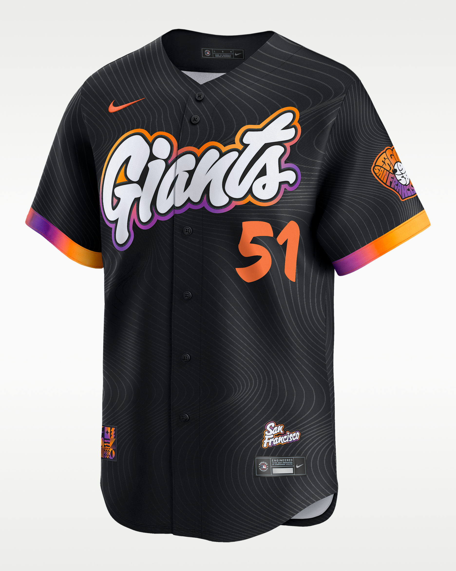

Beautiful font with the jersey, the colors complement it well. I wear it every single Giants game and I’ve even gotten a ball because of it!
Its me not you
[This review was collected as part of a promotion.] Beautiful font with the jersey, the colors complement it well. I wear it every single Giants game and I’ve even gotten a ball because of it!
Product received for free, or reviewed as part of a sweepstakes/giveaway or in exchange for a discount.
#teamnike